Category Archives: #Letter365

The inspiration of other artists – stealing a bit!

#Letter365 No107 on the wall of the Floozie's Jacuzzi
No107 on the wall of the Floozie’s Jacuzzi

Today’s piece was created and posted in Birmingham (although the printed elements of the envelope were prepared yesterday in advance) and the picture above was taken in Victoria Square on the wall of the pool where some words from Burnt Norton, one of the Four Quartets by T.S. Eliot are carved:

And the pool was filled with water out of sunlight,
And the lotos rose, quietly, quietly,
The surface glittered out of heart of light,
And they were behind us, reflected in the pool.
Then a cloud passed, and the pool was empty.

But at present the cloud has permanently passed as the pool is drained and the fountains stilled presumably for maintenance:

To look down into the drained pool.
Dry the pool, dry concrete

So there is a little touch of inspiration from Eliot and the light-hearted Brummie love of its public art. My picture of the Floozie says it all:

Floozie in the Jacuzzi with seagull and bird dropping

And of course behind and below the Floozie is Gormley’s Iron Man, a little of its magic rubbed off on me I hope, and round the corner is the Museum & Art Gallery with its great collection of Pre-Raphaelites amongst much else, though sadly I don’t think there are any Rauschenbergs there. And, of course, the stunning new library is not far away. I have been reading about Rauschenberg and looking at his work a lot recently. I think if I had become familiar with his work in the late 60s I might have studied painting rather than sculpture or perhaps I might have had the courage to be bolder in my sculpture. It is only today that I am really beginning to understand the very radical nature of his work and the interesting questions he has been asking through his career. His Erased de Kooning Drawing for example is intriguingly complex. Rubbing out Iron Man or TS Eliot is a little more difficult!

When I came to post No107 I was surprised to find the letter boxes at the Post Office had been painted white with no helpful patterns to educate you in how to post a letter.

#Letter365 No107 gets posted in Birmingham
No107 gets posted in Birmingham

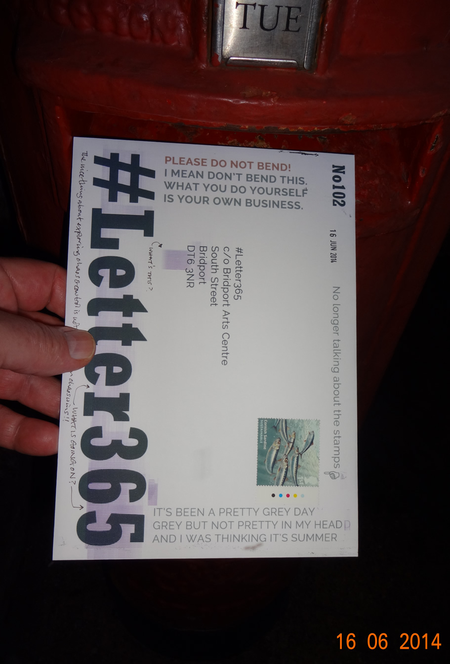
And someone (is there anybody out there?) is bound to want to see the back of the envelope:

Back of No107
Back of No107

The printer problem gets worse – action needed

Printer error on #Letter365 No104
The printer problem is even worse on No104

If you read the back of the envelope you will see I felt there was a sense of the I Ching in the way I wrote, and then wrote a parody. When I came to title this post I felt the same thing and had to hold myself back from making it sound more Confucian!

I think I have said all I want to say on the envelope except to emphasise that I think the printer patterns have gone too far. I checked the drivers and printed – they are ok – and printed out a photgraph with interesting results, so it must be the nozzles. Watch out for tomorrow’s exciting installment!

Back of No104
Back of No104

Oh no, the special #Letter365 box has gone!!!

#Letter354 No103 can't be posted!
The #Letter365 box has eroded away!

I could pretend that I was surprised and deeply upset that the special #Letter365 box in the Bridport Arts Centre foyer had disappeared when I went to deliver No103 by hand. The truth is that Polly had been kind enough to let me know in advance that another installation was using that space for a few weeks and a very interesting array it is too!

The email Polly Gifford sent
The email Polly sent

So I had to post this piece into the hands of lovely Dee, who finally appears in a picture with enough of her face showing to be recognisable. You will note the worsening state of the printer errors front of the envelope. My annotation about it on the back appears below:

Back of #Letter365 No103

Chaos makes its mark on No102

Unexpected printing on the envelope of #Letter365 No102
Printer errors wreak havoc on the envelope of No102

The great thing about exploring the interplay between chaos and control is that when it all fucks up it is just the effects of chaos in the ascendant. In other spheres at other times marks on envelopes or any other unforeseen mistakes or problems would have caused me a lot of unhappiness and anger,

The marks on today’s envelope are quite attractive and it would be gret to be able to reproduce the effect at will and they did mar what should have been just neutral grey and red. You might notice that the red is hardly red. I have been blaming the paper, but I fear the printer is on the blink. I might have a little investigate one day soon.

Reverse side of envelope of #Letter365 No102

A fitting piece for No100

#Letter365 No100 gets posted
No100 goes in the box

Here I am sort of celebrating reaching 100 consecutive days of this project, and yet I wonder why we put such a significance to round numbers? It has become anathema  to me on the radio or in papers every time there is some spurious celebration to mark a centenary or more usually just a round number like 40 or 65 or 950. Mostly these numbers have no magical or symbolic significance – a notable exception being a jubilee – it’s just an excuse to sell something. If you have no ideas look up dates or create a top 10/50/100.

Anyway, it’s a pretty good piece and I am glad I used the idea I used rather than the one I originally had in mind. The one I didn’t use needs more consideration and probably more space.

Back of #Letter365 No100
Back of No100

Oh no! now I’m annotating the front

Annotation on the front of #Letter365 No99

As if it wasn’t enough to create an artwork every day for this project AND put it in an envelope AND print messages on the front of that envelope AND seal the flap with sealing wax AND annotate the back: as if all that wasn’t enough now I have started annotating the front too! What am I doing?

Is it perhaps because it is Friday 13th and full moon? Is it perhaps that it is a hot day and I did some strimming in the garden today and a whiff of petrol and nettle juice mixed with grass pollen has tipped me over the edge? Or is it perhaps that my obsessive nature has got its claws into this project?

Anyway, the offending dot of watercolour could be a clue to what is inside or to the work I did immediately after that kept me from posting it straightaway or I could have just put a spot of paint there as an excuse to annotate the front and write about it on this blog. If nobody buys it you will probably never know.

The other day someone said they enjoyed my Twitter feed as it had a Mornington Crescent feel to it. I sense this blog is going that way!

Back of #Letter365 No99
Back of No99
#Letter365 No99 gets posted in bright sunshine
No99 gets posted in bright sunshine

Slight change of plan and thoughts about the nature of words

#Letter365 No98 gets posted in the gloaming
No98 gets posted near dark

Again I could have posted this earlier, but having already missed the post I decided to do some drawing before I went to the post box. Of course the later it got the less enthusiasm I had for writing this. Now it is late and I am struggling a bit.

The slight change of plan refers to a committment I made to myself a while back about these pieces, and I found that I no longer wanted to try to develop that idea – at least not today – as it was stifling my creativity at the expense of my obsessiveness. I made a slight change and I’ll see how I feel about it tomorrow and decide then how I move forward with it.

The thing about words is because I love words and words like “steadfast”, “staunch”, “resolute” and “endurance” take me back to reading an old copy of Jane’s Fighting Ships (falling apart and covered with brown paper) that we had when I was a child. Repulse, Renown, Relentless, Dreadnought, Stalwart, Staunch, Indefatigable and Bulwark are names that hold so much power and strength yet as mostly unused in our common language these days. As a child, even with an explanation, it was a long time before I could comprehend the concept of an “iron-clad” vessel: somehow I thought the buoyancy of a wooden ship came from the fact that wood floats and that the weight of metal would cancel it out. I had no problem, however, with the concept of an all metal hull. I probably only have this memory because of the taunts and barbs of my eldest brother at my inability to understand.

The back of #Letter365 No98
The back of No98